In an age of optical scanning, the look of optical printing is considered a bit artificial today by f/x people in the industry. At the same time, in outdoor malls, the staging begins to look more like movie mattes, or trompe l'oeil. Like a movie set before the cameras roll, it becomes a Baroque sculptural collage. Even model drawings for mattes resemble handbooks from Baroque eras. The space appears as trompe l’oeil; then the shutter clicks. This clash of fake with real is filtered smooth once it passes through a lens. That causes a diffusion effect, like the world through glass before you open the car window. The glass collapses the middle ground into the background. That diffusion turns all film into a hidden effect - the erasure of difference; the invention of a flattened solidity. The movie set is Baroque (Artifice invading nature). Once that Artifice filters through the lens, the movie becomes panoramic (the machine replacing nature). We walk through the Baroque, while it vanishes on film. Silent filmmakers occasionally toyed with this parallax. Buster Keaton made that part of his signature. A building collapses on Buster. The gap in the door frame saves him. But he looks strangely unconcerned, even though the facade weighs over a thousand pounds. It’s sculptural solidity turns into trompe l’oeil against the flat screen. The air itself can be trompe l’oeil as well. And Los Angeles’s climate has it’s own diffusion effect - a very, very faint fog over a semi-arid sky. It was called haze in 1890, then smog in 1943. Clouds almost never seem to float overhead in L.A., unless it’s humid. They sit like matte paintings over the mountains, in deep focus, on the horizon.
Klein, N M. (2004). The Vatican to Vegas: A History of Special Effects. New York: New Press.
Overall, I didn't enjoy reading the Vatican to Vegas, as a book it is very long winded in the way it is written. It's not the easiest to read. I also felt like that although there is some merit in the way that classical art has inspired theater and theater has inspired film and special effects, as sculptures have inspired model making, I don't think the book is very concise. It tends to go off on a tangent regularly which is a bit annoying when reading, I think it wouldn't be if it was interesting. One of the first chapters spends over half of it talking about a war that last thirty years around 600AD and I just think we've moved on since then. And it goes on about Iraq a lot and I understand that these things need to be put into context as to what's going on in the world but I don't think this much detail is needed.
But what did work in my favour is the fact that because the author had been so long winded about all the wars and the content when it came to actually describing the process of Matte Painting he was actually a lot more concise than Richard Rickett and the other authors, so this was a positive. The only other point in the book that I thought was really applicable was the above quote comparing the art form of matte paintings as Trompe L'Oeil. When you think about it, it is actually a pretty obvious comparison to make, the similarities are undeniable, I think if anything the matte painting is an extension of the Trompe L'Oeil art form. My reasoning in saying this, is that when you film the matte painting, some of the quality is changed, so they look more realistic than the Trompe L'Oeil. Also because they are painted on glass and they are painted really flat they look more professional than the Trompe L'oeil.
For a while I was reading this book, and I’m not going to lie, I didn’t have a bloody clue what they were getting at. I mean everything about it from the way it starts off is just so over the top. I think this is because I’ve come to the conclusion that academic writing is a little pretentious for my like, I clearly must not be on the same wavelength as these people. Case and point:
The word ‘sublime’ may seem rather outmoded [I think the word outmoded is outmoded dear author] - etymologically it comes from the Latin sublimis (elevated; lofty; sublime) [why does the author feel the need to use so much punctuation? and three examples of synonyms? Is it not obvious that the latin word sublimis must mean sublime seeing as the title of the book is sublime and this is the introduction? Is it just me or is this not a bit patronising? how do people read these books for fun? he continues…] derived from the proposition sub, here meaning ‘up to’, and, some sources state, limen, the threshold, surround or lintel of a doorway, while others refer to limes, a boundary or limit.
So then the author waffles for a bit and introduces a character who wrote some Greek pieces of Text who is classed as ‘an anonymous Roman-era author known as Longinus.’ Very mysterious. But there is one meaningful sentence.
Longinus had declared that true nobility in art and life was to be discovered through a confrontation with the threatening and the unknown, and drew attention to anything in art that challenges our capacity to understand and fills us with wonder. The sublime artist was, according to Longinus, a kind of superhuman figure capable of rising above arduous and ominous events and experiences in order to produce a nobler and more refined style.
Well, how incredibly poetic is that. How does this statement not make everyone in the world want to be a painter of sublime pieces of artwork? I know it makes me want to be. Okay so I continued reading and I’ll some it up in a nutshell but basically I don’t think it’s relevant just because of the way it’s written, it’s really not worthy of quoting isn’t the first 100 pages. But basically the books thinks there’s three types of sublime and there’s the sublime that’s full of horror and then there’s beauty and the technology. The thing that annoys me most I think is the fact that the author basically (well it seems to me this way) to name drop every philosopher possible, as soon as possible in the introduction. So it probably wasn’t the best book for someone who really doesn’t care about whose taking credit for the thought because I’ll forget after a good night’s sleep anyways. But he goes from Nietzsche to Marxism is like three sentences, without joining the dots, but he will spend like an entire page breaking down the word sublime into Latin. I just don’t need that kind of structure in my life.
But I somehow persevered with said book (although I might of skipped twenty pages) to the beauty section seeing as I thought that’s where art and painting would be mentioned again. It’s not mentioned again till pg 108, I fell asleep twice trying to get there.
Originating with Longinus, the Sublime was fervently explored in the later eighteenth and early nineteenth centuries and recurs constantly in the aesthetics of such writers as Burke, Reynolds, Kant, Deidot and Delacroix. [why is the author name dropping again? what even is the point of this? The only one I could think of is that these are big names everyone knows of them even if you don’t like theory but it’s just not necessary, honestly.] For them and for their contemporaries, the Sublime provided a flexible semantic container for the murky new Romantic experiences of awe, terror, boundlessness and divinity that began to rupture the decorous confines of earlier aesthetic systems. As imprecise and irrational as the feeling it tried to name, the Sublime could be extended to art as well as to nature. One of it’s major expressions, in fact, was the painting of sublime landscapes. pg108. - literally the only reason I typed up this paragraph is to introduce the theory of sublime landscapes we finally got there, that is essentially what a matte painting is, if you think about it romantically. (or a metropolis but that comes a bit later in the book.. )
A case in point is the dwarfing immensity of Gordale Scar, a natural wonder [personally wouldn’t go that far but that’s subjective] of Yorkshire and a goal of many Romantic Tourists [HA! It’s no Paris.] Re-created on canvas between 1811 and 1815 by the British painter James Ward (1769-1855), Gordale Scar is meant to stun the spectator into an experience of the Sublime that may well be unparalleled in painting until a work like Clifford Still’s 1957-D. In the words of Edmund Burke, whose ‘Philosophical Enquiry into the origin of our ideas of the Sublime and the Beautiful' (1757) was the most influential analysis of such feelings, ‘Greatness of dimension is a powerful cause of the Sublime.’ [OKAY FINALLY, this is where I want to apply it to Matte Painting, so what I’ve come to realise from doing my research into Matte Paintings is how large they all are. When they were traditionally done, they weren’t small pieces of work, if you look back at by timeline of Matte Paintings you can see the artists stood next to them that’s what makes them sublime. And even with the digital matte’s the actual canvas size is gigantic to what’s compressed that’s why they always look so detailed even though they actually aren’t. I think this is what I need to do with my practical work. I need to go bigger than the glass matte’s I’ve been working on. so the end of the paragraph…] Indeed, in both the Ward and the Still, the spectator is first awed by the sheer magnitude of the sight before him. (Wards canvas is 131” by 166 inches; Still’s 113 by 159 inches.) [Okay so maybe this is a bit extreme, I can’t decide if including this theory into the academic writing is going to be too pulling teeth, I don’t want my paper to just tick boxes for the sake of it, I want it to represent me.] At the same time, his breath is held by the dizzy drop to the pit of an abyss; and then, shuddering like Moore at the bottom of Niagara, he can only look up with what sense are left him [is it just me or does this part of the sentence not make sense? Are left him. Poor writing - even by my standards.] and gasp before something akin to divinity.
The next part of the text goes on to exaggerate dramatically on the ‘dumbfounding size’ and the spectators gaze and other bullshit to be quite frank. I mean the page ends with this sentence: ‘As the Romantics discovered, all the subliminally of God can be found in the simplest natural phenomena, whether a blade of grass or an expanse of sky.’ I take it that wasn’t the eighties new romantics he was on about here. You’ve lost me dear author. He continues to babble on about how certain objects in the painting can be sublime too. I think this could be applied to compositions of matte paintings, because you literally do have the power to create the most perfect reality, if you put the elements (objects) in the right place, to make it sublime. It’s at the artists discretion, but it is all very subjective.
The chapter then continues with Turner’s paintings, ‘If the Sublime can be attained by saturating such limitless expanses with a luminous, hushed stillness, it can also be reached inversely by filling this void with a teeming, unleashed power. Turner’s art, for one, presents both of these Sublime extremes. In his ‘Snowstorm’ of 1842, the infinities are dynamic rather that static, and the most extravagant of nature’s phenomena are sought out as metaphors for this experience of cosmic energy. Steam, wind, water, snow and fire spin wildly around the pitiful work of man - the ghost of a boat - in vortical rhythms that suck one into a sublime whirlpool before reason can intervene. And if the immeasurable spaces and incalculable energies of a such a Turner evoke the elemental power of creation, other works of the period grapple even more literally with these primordial forces.’
What I like most about this quote is that even though over half of it is gibberish, the way I interoperate it, is that the power is the atmosphere. And that’s what I’ve noticed in a lot of digital matte paintings, especially in the modern ones, the most successful ones are the paintings with the most atmosphere. Well the atmosphere in Turner’s painting are created by the textures of the brushes - which I know isn’t what creates it in the matte painting’s (please see blog post on painting by matte painter’s quote), it’s the lighting that second creates this empowerment. So it’s seems like the techniques that makes these landscape paintings sublime is the same thing that makes matte painting’s successful in the eyes of Ellenshaw.
The 'third master’ of the sublime landscape painting in the eyes of this book is Jackson Pollock, and the author has lost me here. This is too far. See picture. I feel like no comment from me is necessary here.
I quite liked this quote:
‘With the computer, and brought together in the telematic embrace, we can hope to glimpse the unseeable, to grasp the ineffable chaos of the becoming, the secret order of the disorder. And as we come to see more, we shall see the computer less and less. It will become invisible in its immanence.’
Roy Ascott, ‘Is there love in the Telematic Embrace?’ 1990.
I’m not entirely sure what the telematic embrace is, I’d be tempted to look up this book if I find a place for the Sublime in my dissertation. What I liked about it is that it kinda sounds like a poetic way of how the industry changed in matte painting, when the matte artists got pushed out the door and the computers were brought in and those that persevered had to learn the secrets of the computer to keep there jobs and then as the industry progressed they didn’t need to be technicians anymore it was back to being artists as the use of computers is mainly second nature to everyone.
So the rest of the book carried onto being wordy and so on, but there was one paragraph that really stood out to me. It kind brought contrast between the transition from traditional to digital matte painting, like the transition from painting to photography. But photography freed painters, they no longer had to paint in a photorealistic style they were free for fabulous colours and weird perspectives, but matte painters were forced to become more photorealistic. I thought this was an interesting realisation I had. I don’t know what use it is at this stage.
Painters had already set themselves to the task of documentation (one thinks here of Gustave Courbet, of Edouard Manet), but they were quickly overtaken in this. Their procedures could not compete: slow professional learning processes, costly materials, lengthy production periods, difficult objects to manage - in short, the cost of the whole endeavour was high compared to the relatively minimal total cost of making a photograph. Later, Marcel Duchamp concluded that it was no longer a time to paint. [rubbish he was biased because he was a master of photography of course he would say that, love his photographs though.] With photography, the idea of the industrial readymade had arrived. Those painters who persisted had to confront photography’s challenge, and so they engaged in the dialectic of the avant-garde which had at stake the question ‘What is Painting?’ Painting became a philosophical activity: [really? are you high? yeah sure it could be sometimes, but lots of times it isn’t, the queen still commission’s painting and have you not seen that amazing new tv show the next great landscape artist, it’s like america’s next top model but for painter’s and it’s fantastic and I’m pretty sure they aren’t in a philosophical state of mind when they are competing they get super stressy. This author is bonkers.] previously defined rules governing the formation of pictorial images were not enacted and applied automatically. Rather, painting’s rule became the re-evaluation of those pictorial rules, as philosophy re-evaluates philosophical syntax. [from here on the author goes off on one, which i can’t appreciate but I like the start of this paragraph, he just seems to have very different idea’s on how it developed as an art form in comparison to how history documents it.]
The final quote I liked from this book which I won’t use in my dissertation but I want to share it with you because it’s poetic and I think it’s like you know the saying, a painting says a thousand words, from this little poem I have the painting in my head, and I thought this kind of philosophy is the kind of thought provoking thing this module had in mind for us creatives:
‘A sea memory, I am quite sure that it’s a memory of the sea. Not a cloud in the sky, a sharp-edged horizon, waves surging in endlessly from beyond. When I saw that vista, it was as if something in my infant consciousness awakened from a long dream. I looked around at my hands and feet. And then I seemed to be looking down on myself from above. As if I were there merged into that seascape.’
Hiroshi Sugimoto, ‘Noh such thing as time’, 2002. NB: After a revisitation to this text, I have come to the conclusion that it is not the author's fault, yet the fact that there's so many other pieces of text's like this that would spur on such a way of writing. I mean look at this, this is all his reference's for the introduction. Bravo so well informed.
N OTES
1 Thomas Weiskel, The Romantic Sublime: Studies in the Structure and Psychology of Transcendence (Baltimore: Johns Hopkins University Press, 1976) 3.
2 Philip Lacoue-Labarthe, ‘Sublime Truth (Part 1)’, Cultural Critique (Spring 1991) 26; reprinted in Jean-François Courtine, ed., Of the Sublime: Presence in Question (Albany: State University of New York Press, 1993).
3 Edmund Burke, A Philosophical Enquiry into the Origins of Our Ideas of the Sublime and Beautiful (1757) Part II, Sections I–II; ed. Adam Phillips (Oxford and New York: Oxford University Press, 1990) 53–4.
4 Immanuel Kant, Critique of Judgment (1790); trans. J.J. Meredith (Oxford and New York: Oxford University Press, 1973) 106.
5 Friedrich Schiller, On the Sublime (1801); trans. Julius Elias (New York: Ungar, 1966).
6 G.W.F. Hegel, Aesthetics: Lectures on Fine Art (c. 1818–26; transcripts by one of his students, Heinrich Gustav Hotho, published posthumously in 1835 and 1842); trans. T. M. Knox (Oxford: Oxford University Press, 1975).
7 Arthur Schopenhauer, The World as Will and Representation (1819) vol. III; trans. Jill Berman (London: Everyman, 1995).
8 Friedrich Nietzsche, The Birth of Tragedy from the Spirit of Music (1872); trans. Shaun Whiteside (Harmondsworth: Penguin, 1994).
9 Sigmund Freud, Civilization and its Discontents (1930); trans David McLintock (Harmondsworth: Penguin, 2002) chapter 4.
10 Walter Benjamin, ‘The Work of Art in the Age of Mechanical Reproduction’ (1936); in Illuminations , ed. Hannah Arendt, trans. Harry Zohn (New York: Schocken Books, 1968) 217–51. 11 Carl Jung, in Jung on Alchemy, ed. Nathan Schwartz-Salant (Princeton: Princeton University Press, 1995).
12 Georges Bataille, Inner Experience (1954); trans. Leslie Anne Boldt (Albany: State University of New York Press, 1988) 12.
The Great Train Robbery: 1903: Technically speaking not a matte painting but a double exposure one of the earliest examples of composite in film of two live action film stock, where the train moves through the back of a window.
California Missions: 1907: Norman Dawn's first film of derelict churches around california, enhanced to there former glory with matte painting.
These include composite photography using mattes and counter-mattes with part of the frame blocked off in each exposure, which can be seen in Italian epics such as Cabiria (Giovanni Pastrone 1914) Any slightly unsteady movement of the film in the camera gate would reveal the appearance of a black line between the two separately exposed parts of the frame.
Oriental Love: 1916: Was Dawn's next development of matte painting.
Robin Hood: 1922: Extended castle with matte painting saving thousands of dollars.
Dancer of the Nile: 1923: pier shot, palm tree glass painting
The Spanish Dancer: 1923.
Slander the Woman: 1923: A behind-the-scenes photo showing a glass-shot setup. This shot establishes the ice skaters on a frozen lake with the glass painting finishing off the mountains and lodge above their heads
Where the North Begins: 1923: The film was dyed to have some illusion of colour and provide different moods for different scenes enhancing the mattes.
The Rubaiyat of of Omar Khayyam: 1923: Visionary matte artist and film maker Ferdinand Pinney Earle preparing one of the dozens of matte paintings.
Die Nibelengen: 1924: The first example of the 'Schüfftan process’, see the blog post on techniques of matte paintings for more information.
The Thief of Bagdad: 1924: this film was later remade and really influenced the history of mattes so I think it's important to see some of the original matte's in comparison.
Metropolis: 1927: The first use of Matte's as a cityscape, the one that has inspired and is referenced in a lot of sci-fi films today.
Napoléon: 1927: This complex shot of compositing in camera is broken down into segments into the above photo.
The King of Kings: 1927
For the term of his Natural Life: 1927: Tasmania glass shots by Norman Dawn
For the Term of His Natural Life was an epic production – more expensive and ambitious than anything made in the silent era in Australia and symbolic of the tensions within the industry. It was a banner production of ‘The Combine’, the dominant force in the Australasian cinema business, and it was a considerable success with Australian audiences. The problem was that it was always intended to be more than that. The original director, Raymond Longford, was asked to step aside for Norman Dawn, a Hollywood director who had come to Australia to make scenic travelogues. Dawn was an expert in special effects, action and working in difficult locations, such as Alaska, but he was no match for Longford in direction of actors or the subtle mechanics of storytelling. That Australasian Films (‘The Combine’) gave Dawn the reins on this high-profile film of an Australian classic shows that subtlety was not what they were after. They wanted a picture that American distributors would buy, because it had an American director – albeit one who was certainly not of the first rank. In the end, it did not matter who directed it – the film’s US prospects were destroyed by the arrival of a reliable means of delivering sound on film. Australasian spent £70,000 making For the Term of His Natural Life in 1927, an unheard-of sum for the times (seeAustralasian Gazette – 70,000 Pounds Production Nears Completion, 1926), but they took a severe loss on the film because no-one foresaw that the introduction of sound was about to change everything.
Noah’s Ark: 1929: A very famous matte painting in terms of historical, here we can see where matte's can influence perspective of objects and increase the story telling power by increasing the size of an object when it is painted on. Although I think the ship in this isn't as well painted as some of the other matte's because it looks a little flat. Needed more tones.
King Kong: 1933: Used williams travelling matte paintings, along with a lot of miniatures, but is one of the most famous, and instantly recognised, mainly because of the character KingKong himself.
The Ghost Goes West: 1936: “Pop Day”, I think this is a good example to include as it shows that quite often the same thing would have to be painted but in different lighting set ups, so here we have day and night, but also frequently different weather set ups.
The Adventures of Robin Hood: 1938: I include this one because it was one of the first films to ever be made and has been remade a ridiculous amount of times, and I think in this first remake you can see how the facade of the castle is made to look even bigger by having it curl round the view of the windows, it's possible that these early castle mattes inspired the look of Hogwarts, I think this is important because it's such an icon in today's pop culture.
Gone With the Wind: 1939: over 100 composites and mattes using optical printer. This film blows my mind, because the first few times I watched it I didn't even really think about how many matte shots were in it, and I still can't spot them all to this day it's just such an extraordinary film.
Wizard of Oz: 1939: pastel paintings later turned to oil, I think it's interesting to also compare these to the remake of the modern Wizard of Oz, which I think I will do in seperate post later on.
Hunchback of Notre Dame: 1939: By Chesley Bonestell. I think I liked this matte painting of the Notre Dame even more because I've been to see it in all it's grandeur in real life and it's super impressive and I think this matte has a lot of detail and scale that you get when you see the cathedral for the first time so I had to include this in my extensive list.
Only Angels Have Wings: 1939: Chesley Bonestell - paints the future/space age work, before into matte painting was part of the team designing and repainting the golden gate bridge over and over for Errol Flynn.
The Thief of Bagdad: 1940: Won the 1940 academy award for Special effects. The final production featured some 265 effects cuts, estimates effects artist Jim Danforth.
How Green was my Valley: 1941: By Chesley Bonestell, I really liked the street scene and in the film the mill in the back and the houses actually smoke and I think this is when VFX teams really started to come to life in the movie industry, during the war time when everything was about saving money, artistry in films really flourished.
The Magnificent Amber Sons: 1942: Another building matte by Chesley Bonestell here, I don't think it's as successful as some other his other mattes because the contrast and lighting is as definitive as it is on the people so it does look a little fake but I think it's good to see some of the weak ones as well in this list.
White Cliffs of Dover: 1944: Now I appreciate the images for this aren't very big, but what I liked about the matte's in this film is how real they are, it's creating a more perfect version of our world. A cleaner relatable one to tell the story. I don't know why but audience's always find this more captivating, a perfect example of a director who does this is Wes Anderson. Every minute detail is perfected.
Thirty Seconds over Tokyo: 1944: Terraced rice farms were created, with scrolling water reflected in a mirror and filmed behind glass matte painting. I couldn't find any imagery of the actually rice farms, but I did find some cool footage of how they made the aeroplanes in miniatures and had lots of mattes/backgrounds, [this is really starting to upset me as to know the definitive elements between a matte and a background it's a massive blurred line, because if it's a miniature being animated in stop motion surely the painting behind it is a background, but no in all these classical films they are mattes.] and flew the planes over the paintings and had weird and wonderful camera angles on the work.
Since you Went Away: 1944: Jack Cosgrove matte paintings, war meant less money for sets and space. Oscar Nominated.
The Yearling: 1946: There's less focus on the matte's in the shots I chose for this film but more on the compositing and that's something I've come across from putting together this extensive list is the amount of compositing knowledge is need to make good matte's. I think this is what is putting me off doing my practical work, because I don't have this. But I just need to get on with it now.
It’s a Wonderful Life: 1946: only the first two floor were built for George and Mary’s dream house at 320 sycamore street.Painting by Jack Cosgrove.
Duel in the Sun: 1946: The matte shots in this one had a new camera mounted on a motorised stand that could mimic the movement in the live action in the matte painting. Being a western this is highly important because a notable thing about this film is that it uses a ridiculous amount of jump cuts (not in a bad way) but it's because it's an action packed film, so to have this development where you could use travelling matte's was born from this need to tell stories at a faster pace.
Black Narcissus: 1947: This film is one that has been covered in almost every book on matte painting, mainly because of the drop down perspective off cliffs, that one shot has in some way shaped so many films today because there's an unlimited amount of productions off tall buildings where it looks down on the roads to give and empowerment to the landscape. What I really like about the matte's is not so much the vastness of the perspective but actually the vivid colours, they are hypnotic, the colours themselves add to the dizzying height.
The Paradine Case: 1948: Hindley Hall mansion mainly done with matte painting, my personal favourite matte painting with the sunlight reflected on the wall painted by Spencer Bagdatopoulos, even painted banisters and stuff meticulous attention to detail. (Directed by Alfred Hitchcock so obviously the attention to detail was outrageous.)
The Fountainhead: 1949: Ceiling mattes for studio lights, also the matte behind the building with rare amazingly well painted signage.
Destination Moon: 1950: Chesley Bonestell, now again as much as I love these paintings, how are they not backgrounds for stop motion animation of the rocket and indeed matte paintings? This topic is now starting to hurt my head. When does the line not blur? Does it always blur? Does it not matter because it's the same skill set and no one who is reading this actually minds because we are just appreciating great piece of work here?
An American in Paris 195: Now I included this one, because I don't think the perspective is right on the Eiffel Tower. I think it probably only worked as a fleeting scene, now I couldn't tell you how long it lasts, the reason I don't think the perspective works is for two reason, so number one is the base of the tower, in real life isn't that tall you can't see the base from a distance and there's a lot of it on show there, also why do you the house get so small in the distance and the Eiffel Tower look so out of place, also the second reason is very subjective to me having an artistic eye, the two rows of houses at the front go away from the viewer and the lines of the base of the tower are completely out of sync, and if you're painting it you'd just tidy it up and make it fit nicely either with the houses or the lines of the balcony. But being a musical I can appreciate it can be really over the top which is why I also included the really cheesey background shot first to set the standard of this film. I think it's safe to say I won't watch this one anytime soon.
When Worlds Collide: 1951: By Chesley Bonestell. Again another film of Background Vs Matte. None the less I include because I don't know if you remember talking about the Next Great Landscape Artist (The TV Show kind of like america's next to model but with painters), well there was an entry the other week just like this, so I'll probably refer back to this picture in that post.
Androcles and the Lion: 1952: Mattes by Detlesfen.
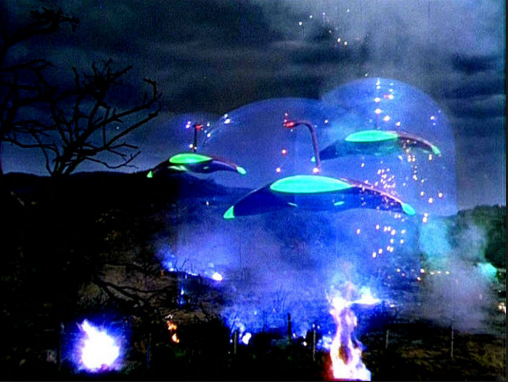
War of the Worlds: 1953: Matte painted galaxies Chesley Bonestell. I honestly never understood the hype around War of the Worlds, except that the sound design is pretty good, I'd never actually sat down and watched the film. But now I get it, considering how many films around this time had been made in black and white, to see the still they are just so colourful, and the fact that most countries had just been at war it makes so much sense now.
The Robe: 1953: first film to be made in 3D had to have two sets of matte paintings one for normal and one for 3D. Mattes by Emil Kosa and Mat Yurcich. http://bigerboat.com/indexfx/?p=1953
Prince Valiant: 1954: Mattes again by Mat Yuricich.
20,000 Leagues Under the Sea: 1954: There's just so many layers to this matte painting, I bet it was an absolute ball ache to do, but it's so pretty. By Peter Ellenshaw.
Helen of Troy: 1956: Lou Lichtenfield head matte painter, now I've included these matte's but again I'm not a huge fan. I think part of it is the fact that the grain so heavy on this film, these paintings could be really good or they could be really shit you just don't know. (They probably are really good theres just a huge loss of quality with the excessive grain because it is Lichtenfield.) I think this might be a technique I adopt if my practical goes tits up, throw some grain on top of it, be authentic looking. (maybe not this much grain though, unless I find the compositing a truly awful process.).
The Ten Commandments: 1956: I saw these two stills from this film and my gut reaction was eurgh I feel sick, this is so weird, why is there so much intense red lighting and ridiculous compositing and no grain on these shots? This is awful. Please don't even show me the matte shots.
The Man Who Knew too Much: 1956: Hitchcock, Pop Day matte artist. just wow. No words to describe how this makes me feel on the inside.
Forbidden Planet: 1956: Top half of flying saucer, Henry Hillock taught Matthew Yuricich how to use razor blades to create a textured effect perfect for the look of this graveyard on the alien world. This is the first time I have heard about texture in painting in a matte, I like it. I like the artificial look because it's scifi. Still doesn't make me tempted to do a SciFi world though.
The World, the Flesh and the Devil: 1959: I really really like this matte painting, because it shows you the original scale of the painting and the fact that they were going to use it as a tilt down and then what they actually used on the screen. Perfection right there, although it's not because it's a shame they didn't use that bridge because it's so well painted.
Darby O’ Gill and the Little People: 1959: Matte by Peter Ellenshaw. I think I'm starting to begin to pick up whose matte's are whose know, Peter Ellenshaw has a very distinctive colour palette and a softness to how he applies the paint. Look at that sky fluffy like buttercream.
Ben-Hur: 1959: Matte paintings for this film were led by Matthew Yuricich, who was oscar nominated for best visual effects for his mattes in Close Encounters '77. For more info on the man see here: http://bigerboat.com/indexfx/?p=1459
North by Northwest: 1959: I actually didn't know about this Hitchcock film till this summer, I'm not really a massive fan of his films because I find it really difficult to watch them as I get really jumpy and can't deal with scary films, but I commend his art direction so much. I just love it, absolutely fantastic. I bet this house inspired the mansion in Twilight. Anyways as I was saying this film was showing in Melbourne, because one of the theaters were putting on a stage production of the film, but it was super expensive to go to the stage production.
Spartacus: 1960: A better example of similar scenes to Helen of Troy.
Search of the Castaways: 1962: Peter Ellenshaw, recognisable by his chalky painting style.
Cleopatra: 1963: - The results can be seen in films such as Cleopatra, where partially built full size sets were built at the cost of hundreds of thousands of dollars while the impressive tops of buildings were painted and added for just a few thousand more. (Richard Rickitt)
The Birds: 1963: Whitlock for Hitchcock on display at Universal Studio's.
Mary Poppins: 1964: I appreciate Mary Poppins has dated a lot over the years, but I think these mattes are perfect examples of successful pieces of work by Peter Ellenshaw. I think they show an influence by the Wizard of Oz pastel mattes and also a development of his style from that influence. I love how simple the silhouette scene is yet it's still magical and captivating.
Marnie: 1964: Whitlock for Hitchcock once again, what I really like is the above shot is perfectly set out on the screen with the third lines and it's an immaculate piece of footage with the ship matte. But the below shot is on a really weird angle, which surprised me because it's hitchcock I'd of thought it would of been perfect. Thought I'd throw this anomaly into the list.
Torn Curtain: 1966: Whitlock, amazing matte, so the right hand side is the film footage and the left is the two combined, how insane is that matte to make it work. I love how the shadows from the pillars are there too so that bit of flickering will add another live action element.
The Adventures of Bullwhip Griffin: 1967: Matte by Peter Ellenshaw, perfect training for hook with this matte of a vast number of pirate ships.
2001: A Space Odyssey: 1968:Joy Cuff worked on the moonscape, making a miniature model of the Moon's ground for the actors to be composited walking down onto: http://bigerboat.com/indexfx/?p=475, This film had a lack of matte paintings, but a large number of model's that Stanley Kubrick would fawn over every detail until they were perfect.
Planet of the Apes: 1968: Statue of Liberty on beach. I don't really remember too much of this film, it's one of those that was always on channel 5 as a kid that I was made to watch and thought the monkey woman was really creepy. But this one scene has always stuck out to me, and to this day if I watch a film and the same beach is used I generally tend to recognise it, it's really strange. What I like about it is how the matte is also shown from a different perspective, although when you think about it's a completely wrong angle for it to be feasible but I like the fact they tried.
The Love Bug: 1969: I love this film, I didn't realise how much the chase road was exaggerated though, I bet this took some advance planning to make it all look like the same road in a sequence of shots. I really disliked the remake of this however I might have a look for a matte shot to compare it to.
Bed Knobs and Broomsticks: 1971: This film came across in the matte painting books several times, but unlike its predecessor Mary Poppins, I just can't seem to distinguish whether they are talking about the animation or not, and it's making me very confused.
The Sting: 1973: Matte by Albert Whitlock, beautiful cityscape with very very little live action in (only a snippet of the road).
Oklahoma Crude: 1973: Matte by Whitlock, during this time a lot of films became centred around the oil industry as it was such a new money thing.
Earthquake: 1974: Albert Whitlock matte painting, I think this shows the mark of the start of natural disaster films, which I think has really pushed special effects up to todays industry because as an audience we are still captivated by natural disaster films if the effects are good enough they really can scare you into thinking that something might be real. (Unless it's San Andreas, because even though the effects are good, and the Rock is a babe, the story is outrageously over the top, but it goes to show we are still trying with these types of films.).
The Hindenburg: 1975: Albert Whitlock matte and miniature model composite, lots throughout this film.
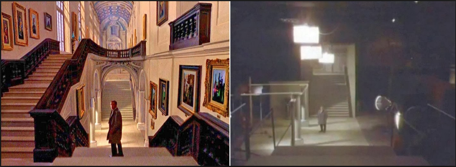
Day of the Locust: 1975: Albert Whitlock, I think that this could be one of his finest pieces of work. I love this ballroom, live action composite, it's simply divine. The ceiling is flawless, this is where I can understand the Vatican to Vegas really inspiring cinema, look at the detail in the ceiling. How much do you wish you were at a party there, what a great throwback in time.
Star Wars: 1977: Matte byFrank Ordaz, what I like about this matte shot, is we can see how big the artist is in comparison to the matte painting, which is great. Also this one has no blacked out bit so it could just be a painting, but because characters walk in front of it, it's not but it's still great as a painting. And thirdly look at that seventies hair.
Close Encounter of the Third Kind: 1977: To me this film is trying too much in it's special effects department. I appreciate that it's an alien film and a bit kooky, but it's effects aren't massively pushing forward since war of the worlds and it's over twenty years later. I also think this matte has a lot of detail in that's lost because it's so dark, which upsets me because it undervalues the artist's work. They might as well have just used a silhouette.
Bound for Glory: 1976: Albert Whitlock, look at this valley, this has to be my second favourite matte to Whitlock's ballroom by the gent. Just a master at his work.
Family Plot: 1976: Whitlock and Syd Dutton, passing the baton on.
The Empire Strikes Back: 1980, so many matte paintings! So many models. A great series of films, but they do just overwhelm me with there special effects on where to start analysing them if I was to go into it but I think it might be nice to compare a little bit with the new one that comes out in a fortnight, if I have time, because it's so topical.
Flash Gordon: 1980: Bob Scifo. I don't know anyone that doesn't love Flash Gordon. I mean look at these mattes. So over the top and cheesey just like the film they are fantastic. The red interior really mimics that of the pastel mattes of the Wizard of Oz's emerald palace. Love it! Also so symmetrical! I also really like how there's a close up of the tree so you can see how much detail is necessary and it isn't in as much as i thought it would be. I'm excited for this.
Blues Brothers: 1980: Matte by Syd Dutton and Albert Whitlock, great example of perfect atmospheric lighting.
History of the World: Part 1: 1981: Albert Whitlock had the chance to paint his vision of ancient rome.
Raiders of the Lost Ark: 1981: Stacked boxes, longest amount of time a single matte shot had to be on screen 45s, the fade out alone was done by hand and was 235 frames long, one of the hardest colour matches for barron to do as even though the floor is a tiny segment it’s grey which contains all the colours in the spectrum and because its on screen for so long they spent ages trying to perfect it.
Ghost Story: 1981: snowy house by Syd Dutton after lots of training under Whitlock
Poltergeist: 1982
Star Trek II: The Wrath of Khan: 1982 --- the pixar touch in technology. First ever 3D technology used in a matte painting.
Blade Runner: 1982: Extreme special effects and beautiful cityscapes taking influence from several of the films we've already discussed. From Metropolis to War of the Worlds, to the timepieces like Spartacus and the columned architecture.
Return of the Jedi: 1983: See previous comments on Star Wars Films.
National Lampoon’s Vacation:1983, Walley World signage theme park, this image is really interesting because in this film they managed to get the signage to glow (it's all the signage that is painted, I think this is one of the few films where the matte looks quite simply painted), the moose is a tribute to Moose Bullwinkle.
Dune: 1984: - Syd Dutton, protégé of albert whitlock, this is a really weird film, of course it is though, it's a Lynch film. However it's amazing to see the transformation of the blue screen to the sandstorm, crazy effects!
Enemy Mine: 1985: Now these are actually for sale on Amazon, and there are preliminary studies for matte paintings for this film, how amazing is that. That's such good research for me because it shows me how much detail the matte artist's go into. I think what I want to do with some of my research footage is to print contact sheets and come up with as many ideas and concepts to improve the shot to the best of my ability.
Goonies: 1985: Now this is a weird one, because to me the compositing of this really makes me think it's a matte painting. I think this has aged like it is a matte painting, but then in the trivia of the film it says that it's the kids actual reaction to the ship because they hadn't seen it before and the director wanted to get it in one take. So I was super confused by this, I'm still pretty sure this part is a matte painting and it was just the reaction that wasn't. But then that doesn't really make sense if they actually had the ship to do a matte painting.
Young Sherlock Holmes: 1985: The first 2-D digital matte painting please see previous blog post on digital matte painting.
Star Trek IV: The Voyage Home: 1986: Good example of the method of integrating models as slide projected reference was used. Matte paintings by Chris Evans.
Willow: 1988 another model and matte painting combo augmentation, as a way of doing skies and models, film was written by George Lucas.
Dick Tracey: 1990: These are my favourite matte paintings I've come across to date. I just love the colours, it's a completely different world but the perspective is perfect. For more reasons as to why they are my favourite see my original presentation on the matte paintings.
Hook: 1991: Now I read that a lot of the mattes for this film were trial and error, during the start of digital production, the lead artists can be found saying that the digital techniques made it look very cartoony, but this is when digital was starting to get really pumped out into film for cost efficiency but was in the period where it wasn't quite as professional and advanced as artists would have liked, so these matte's were carried out traditionally and I personally am so glad they did, Hook is film I grew up with on video and it's just pure magic.
Robin Hood: Prince of Thieves: 1991: So I was unsure as to which book I'd read about this Robin Hood's Matte shots, and besides images of very strange looking mullets, I was unable to google much. However this is a super interesting video on the locations around Britain that were used in the film and how they went about choosing the right ones for the time that Robin Hood is set in. I think this is extremely useful because this is like the step before the matte painting done by other people.
Batman Returns: 1992: Matte paintings carried out at Matte World Digital, the woman painting in the final picture is Michele Moen, I think it's interesting she's the first female matte painter I have come across so far from the 'Golden Age', not that it matter's what gender these people are but, please see short bio of her here: http://bigerboat.com/indexfx/?p=911
The Age of Innocence: 1993: One of the few last films to really use a large number of traditional matte paintings, this film is truly speckled with great matte's, from the colouring in the lighthouse, to the way the town matches the live action footage in both texture and detail to finely the amazing line work in the station, are only a few examples from this film.
The Shadow: 1994: Matte Painting's by Illusion Arts.
City Slickers II: The Legend of Curly’s Gold: 1994: Matte Painting's by Chris Evans, mainly canyon scapes.
Star Trek: First Contact: 1996: Majority Space Matte Painting's and composites.
The Fifth Element: 1997: Matte above by Wayne Haag, who interestingly studied at RMIT in Melbourne.
Carpathia: 1997: The ship was traditionally painted but digitally composited, then the special effect of the smoke was added in after, matte painters used to try and use any excuse to combine traditional and digital techniques.
Kundun: 1997: A film directed by Martin Scorsese, said film has beautiful digitally composited matte paintings of the supposed Tibetan landscape to illustrate the true narrative of the original Dalai Lama, by leading digital matte painter of the time Chris Evans.
The Truman Show: 1998: Here in this main masterpiece of a matte painting was lead Matte Artist, Brett Northcutt who extended single story building with texture wire framed 3D CG extension of second story, this allowed for complex camera movement through a shot but cheaply without having to build the set in person. See more here: http://www.matteworld.com/film/film_archives/truman.html
Beloved: 1998: A series of Matte Paintings were created for this film but unfortunately due to this film flopping at box office there aren't many photo's of the landscapes online. This film is a period piece set in 1873 and one in particular I have come across in my research is a string of factories, with Bob Scifo being the lead matte painter, they are well worth looking at, with animated smoke the VFX are all good in this film.
The Phantom Menace: 1999: ILM, the first 3D wire frame scene that was textured and had animated camera's through the scene to add to the drama of the race. I think personally this borders on animation having an animated character and a live action camera v. interesting that this is still a matte painting but Toy Story from 1993 are just backgrounds.
The Testaments: 1999: Digital matte paintings of mayan temples by Brett Northcutt, see this web page for more information on the production of this film and the use of blue screening and full embracing digital production at Matte World Digital. http://www.matteworld.com/film/film_archives/testaments.html
Gladiator: 2000: This film has a historical time piece matte painting of the Coliseum carried out by Mill Film, the reference used for this film was wembley arena. Matte painting is most commonly used to set a certain time period even today.
The Grinch: 2000 : This is one of the earliest films to composite green screen with the actual edge of the cliff built and the 3D model of the sleigh and dog in a successful composite.
The Perfect Storm: 2000 : Mainly skies matte painted for extreme stormy weather. Successful because it only holds on the shot for a few seconds as it has to be edited in a fast pace way to add more drama. However this film does look horrendous and cheesey and slightly fake now. In comparison to films like The Day after Tomorrow.
X-Men: 2000 : One of the super early versions of 3D wireframe mapping, I included this as it's alot more successful than The Truman Show and as the X-Men series has developed in the last fifteen years so has the 3D Mapping read about here: http://marvel.com/videos/watch/2006
For film's from the last fifteen years and tv show's please see this collection on Pintrest. I decided to only stick with the 20th century with this list as it shows the transition from traditional to digital perfectly into context of time:https://www.pinterest.com/riqueiroz/matte-painting/
Also with Special thanks to NZPete's blog to help find some of the matte images, to see more and know more about the golden age of cinema please check out his blog: nzpetesmatteshot.blogspot.com