Tuesday 25 March 2014
FINISHED ANIMATION!
This is my finished animation, I am a bit sad that I did not have time to do three examples however during the time constraints I think I made the most out of an icky situation. And I am really proud of the two examples I have completed and I think the sound works really well with them. I am kind of glad that these two are of high quality rather than three rubbish ones, but next time I shall try and manage my time better.
Jiri Trnka, The Hand compared with The beach
The hand - (1965) - (Jiri Trnka) from Roberto Pernas on Vimeo.
I want to start this comparison with a link to an archived article on Trnka, http://old.bfi.org.uk/sightandsound/feature/49844, that is a beautiful summary of his career, that brings context and knowledge to his work.This particular animation (The Hand) is completely different to any other pieces of his work, it has a subtle melancholy about it, and even the colours seem more sombre. I really like how the BFI article names Trnka and other eastern european (Dušan Vukotić is a prime example, maker of Ersatz(English for The Beach), which is Yugoslavian) as a refreshing alternative to Disney. The first ever film I saw at the Cinema was Fantasia but I wish I had, more access to films like this at an early stage, because they really are so well done. They tales they depict have such deeper meanings and more context behind them, than the mainstream Disney. Even today neither of these shorts have aged very much, they are still cutting edge and beyond being ahead of the times.
Regarding Trnka's, The Hand, I never really payed much attention to History, especially that of Eastern Europe, If you showed me a picture of Stallin I probably couldn't name him. I can't even describe the regime he stood for, I think it was communism, just double checked to find out the Soviet Union were Communists. It's not that I have been purposefully insolent about the subject, I have just never had need to know about it. The first time I watched this animation was back in Foundation last year and I knew nothing about the subject I just thought it was a sweet, humorous possibly slightly dark animation. And then I discovered the context and how Trnka uses the Hand to portray the Czech government of the time, to make a social commentary about how oppressive it was and how they paid artists to make what they wanted them to make and there was now way they could make what they wanted (the little artist has to make models of the hand rather than his plant pots and dies trying to escape the system). I think it took a lot of guts to speak out against the government especially considering the trials and tribulation he faced afterwards. He was practically shunned from the government, I also found it really interesting in the article how BFI say he didn't get a state funeral, but the puppet in his animation did. He has since later been acknowledge and in Czechoslovakia there is a statue and memorial in his honour.
In comparison Ersatz touches a more common theme of how woman are portrayed on screen, more importantly how the male figure have created the definition of what a woman looks like, and how men have the right to fight over them. It also touches on consumerism and people's affliction with things. And how we need things to show off to get a partner and in the end none of it really matters. Again it's a social commentary on how people were living in Yugoslavia at the time. Which again felt the power of communism and the Soviet Union.
Most importantly there is a difference in techniques between these two shorts, Trnka's Hand is a combination of stop motion and live film, where as Ersatz is traditional cell animation. I think the sound is more successful on Ersatz, but the technical animation ability is far better on Trnka's. You can see how works like a Midsummer's Night Dream, with pixie Character inspired the movements of the little artist puppet, who is practically a dancer, especially when potting his little feet move in such a perfect Rhythm. I think the difference in live film and puppetry, makes a bold statement about the relationship of the government and the people in the creative industry, perhaps another bold statement is being made here. The main thing that is so successful about the potter is it's delicate silhouette. And the ability Trnka has is convey the happiness of making pots and the heaviness and sadness of being caged up in a gold cage. Another way the sadness is captured is through the painted facial features, that changes so easily with lighting, it is made more sombre with a darker lighting. These are skills that have been cultivated that are much different to Ersatz's. In Ersatz there is skill in the background they are very textured and very beautiful and the movements of the characters are perfectly exaggerated to be instantly recognisable, again there is a rhythm which is emphasised by the sound.
The one I personally prefer is Trnka's the Hand, this is because he stood up for what he believed and paid the consequences and technically I think it is more complex and has a lot more to say, which is more understandable than Ersatz. Also I was a little disappointed when I found out that the animator hadn't written the beach and there was no one person really involved.
Seminar: Animation in the Common Realm
Typical examples of animation being sold as a form of business, are as commercials, pieces of education, or campaigns for charities as a form education, film titles and music videos.
It is possible to have auteurship in the commercial realm, often we can view commercials as a series of short films that are sponsored. It is a lot easier for animated characters to appeal to a larger cross section of the population as it is a lot easier for them to be faceless and to be anyone. This makes them a lot more relatable.
The verst first commercial to use animation was in 1899, recognised as an inventive design piece it uses to stop motion of matches to convince people to send matches to the lads in the war. Matches an Appeal 1899.
In 1929 in russia another innovative piece came out under the Russian Government as a form of propaganda. Advertising the post office Mikheil Tsckhanovsky with Pochta pushed new realms of commercial advertisement.
The boar and the Hare was a high calibre, story book that made references to Watership down and Winnie the Pooh. And just looks so magical being created via cut outs and stop motion even though it looks like a computer flat piece of animation. Such a pity about the song choice though.
Go On.. It’s Christmas, Ant and Dec, Gingerbread man.
Absolutely awful, I've never seen anything so cheesey, it just looks like a cheap commercial, but it's obviously not because Ant and Dec cost loads to Morrisons, Morrisons even sponsor Saturday Night Take Away.
Nintendo, Animal crossing, employs animation to foster specific social skill and life lessons for children, you’ve got to work hard to be able to buy yourself nice things.
It introduces, capitalistic values, working for a living, mortgages, consumerism and never ending but increasing hard to achieve aspirational level of luxury and opulence. There no real objective but to be schooled in social benevolence, for profit and envy.
The word ‘advertising’, like ‘commercial art’ makes graphic designers cringe. It magnifies all that sophisticated and contemporary graphic design, or rather visual communications is not supposed…
Education
Mr Fastfinger,
teaches guitar.
Saul Bass, title sequence. Recognisable holds a prowess, and a authorial voice.
Music Videos. 1980’s is when animation was combined with live action
Seminar: Animation, Auteruship and the Avant Guard
Auteurship is french and suggests that film makers are in there own right artists. True Auteurs have a thematic consistency and artistic development through time. Paul Wells stated that a true auteur has a ‘unique signature’ on a film.
It is recognised as a response to Hollywood cinema how american films are generic, through the culture industry.
Truffaut, a certain tendency in french cinema, attacks french tradition where french films provide images for literacy.
Discourse, area for discussion.
Animation imitates large scale film production.
Offers possibility for a film maker to work alone.
Most auteurist.
Even collaborations requires an auteurist presence.
Few animators are landed as auteurs in relation to feature length animation, mainly this is because feature length animations require a lot of work and many hands so they are generally subsumed by a corporate identity. Also there is a persistent conception animation is for children and is not taken seriously by adults.
Disney, Key figure in the animation business a global corporate giant. The epitome of the american, but politically incorrect and ideologically unsound. Mostly drawn animation including set making. It is often said that the original work done by disney such as slices adventures, is authorial. But the arrival of Mickey signifies it moving in the corporate direction and from there on any animators who worked under disney had there name stripped from the work and Disney kept the overall idea, ownership and vision. Disney went on to adopt some popular books that are cult classics and remake the illustrations into animations for stories like Alice in Wonderland, Pinocchio and Winnie the Pooh, is taking on someone else’s work, through flat illustrations and bringing them to life the sign of an auteur? In my opinion I don;t like how Walt Disney treated others and the way he went about getting to the top. Although Fantasia is one of my favourite films and is the very first film i saw remastered in the cinema and has inspired me from a young age, I think as company even though it makes millions, socially and ethically I think there’s still a lot wrong with it’s morals. And therefore I can’t personally promote him as being an auteur even though he started off as one, because to me Walt Disney doesn’t deserve any romantic recognition. To me disney is just always there, like an elephant in the room. I don’t hate it and I don’t love it.
Ray Harryhausen,
The famous created of ‘B’ Movies that were elevated by his special effects, and they really were special effects. He created King Kong, Tales of the arabian and Sinbad. I find it really amusing that he didn’t want to be classed as a an animator because in cinemas they were only seen as been a thing for children so he created his own new title, Dynamation.
His auteurial signature is often marked as the character and development and formation of the story and the narrative. Although in my opinion the homemade mythical creatures and legends are what make the films.
Avant Guard!
French military term for the pawns in medieval battle. Utopian socialists apply it to the leaders of artist’s, scientists, inventors and literary leaders. Those that push the boundaries, progress to be more modern, by doing things differently.
Seminar: Animation and Genre
Genre is the categorisation of a film, be it a Romantic comedy or a western, genre’s mark the plot line into a classification and pigeon hole them. It is useful to deduce how particular narrative structure work with in certain genres, and how they define them to that genre. This applies to film as well as animation.
A question posed is whether or not animation allows for stronger violence?
In my opinion yes it can do because often it can be so disconnected from real life, and therefor characters can be more violent as they aren’t real. For example it’s harder to relate to a potato man than say bruce willis in an action film. At the same time the responsible woman who wants to be a mother in me says no, because often the people who are more likely to watch animations have bigger imaginations and often are more impressionable, therefore I want to say its not acceptable, because theres already too much violence in the world. We need a time of peace and prosperity.
Often boundaries can be crossed angst genre’s and it can be contradictory to categorised genres. Take old cartoon’s such as Looney Tunes, Tom and Jerry etc they are very violent kids comedies.
Plots can be summarised under generic topics, most animation plots fall under one of these categories;
Maturation, Coming of age.
Redemption, Transition of the Main Character from Bad to Good.
Punitive, where the Main character is good and behaves badly and is punished.
Testing, Will power vs temptation.
Education, main character moves from having a negative viewpoint to a positive viewpoint of the world.
Disillusionment, where the main character moves from have a positive viewpoint to a negative viewpoint of the world.
Discrete categories or types of film defined by visual, technical, thematic or subject orientated consistencies.
A set of codes and conventions which determine particular expectation and
New Word!!
Pastiche, like a parody. (double check)
Absented, to stay or go away.
Where the Wind Belows, Polticalised, nuclear water.
Outcomes in the narrative,
A term based upon the recognition of particular kinds of visual and oral iconography which serve as key signifiers in an implied common language.
Paul Wells 7 Genres
- Formal: A conditional premised to its narrative/thematic concerns.
- Deconstructive, reveals the premises of it’s own construction for comic or critical affect.
- Political, aspires to use the medium to make a moral, ethical/politcal statement.
- Abstract, explicitly explores new technologies and approaches non objective/ non linear works, they resist traditional conventions.
- Re-Narration, uses specific and distinctive vocabulary to reconfigure the narrative
- Paradigmatic, often taken from graphic and literary sources
- Primal, depicts/defines a specific emotion, feeling or state of consciousness.
COP Lecture 12 : Synthesis
Why is design about more than the visual?
Practice can be developed by theory, COP is a development fro contextual studies (the older version of the module) by integrating both. This COP module is more interested in the process rather than the final outcome.
One way to start a project is a PEST test. Political, Economic, Social ad Technological analysis. By doing this 360degree analysis of a new embarkment helps form a deeper understanding developing a clearer investigation and showing a more academic, cognitive process.
"art and design philosophy through meaning"
Then we were shown an example by David Hoffman, the photographer who primarily shoots on political protests a form of documentation of history, one that that makes a bold statement on the power of the camera.
Cop is not about the final piece but more aimed at the process and the development recorded.
Synthesis - complex/dynamic process like a big jigsaw that comes together being mutually dependant on each other. In more lament terms it's the combination of two things, in this case the theory and the practical, in an informed engagement.
Praxis, a term developed by philosopher Marx consists of philosophical and intellectual making.
"Philosophers have only interpreted the world in various ways, the point is to change it." Marx thesis on Feuerbach.
Emphasis on the process and research with continuous reflection. Often this is obvious and designers do it intuitively, but this module aims to get us to think about it to maximise our potential and do all this at a deeper level.
After attending this lecture I now realise the importance of the practical work and I thought that emphasis was on the writing so it's about time I put some serious consideration into the development of my practical work. However I still feel like I have gone about it in the right way because my practical work is based upon the theory of my essay.
COP Lecture 11 : Post Modernism
Postmodernism
Term applied to a wide range of cultural analysis and production since the early 1970s. Whilst there are different attitudes to what postmodernism is, it is generally referred to as a significant shift in attitude away from the certainties of a modernism based on progress. The cultural traits usually associated with postmodern cultural production include the acceptance of many styles, the importance of surface and the playful adoption of different styles through parody and pastiche.
Term used from about 1970 to describe changes seen to take place in Western society and culture from the 1960s on. These changes arose from anti-authoritarian challenges to the prevailing orthodoxies across the board. In art, postmodernism was specifically a reaction against modernism. It may be said to begin with Pop art and to embrace much of what followed including Conceptual art, Neo-Expressionism, Feminist art, and the Young British Artists of the 1990s. Some outstanding characteristics of postmodernism are that it collapses the distinction between high culture and mass or popular culture; that it tends to efface the boundary between art and everyday life; and that it refuses to recognise the authority of any single style or definition of what art should be.
If Modernism is roughly from 1860-1960, then logically Postmodernism is 1960s - Today, However some critics state Postmodernism is over and we have entered a phase of Post-Postmodernism.
If Modernism equates with; Simplified aesthetic, Utopian ideals, Truth to materials and Form following Function. Then Postmodernism involves; Complexity, Chaos, Bricolage (mixing up of styles and materials), Parody and pastiche and irony.
Postmodernism has an attitude of questioning conventions (especially those set out by Modernism)
Postmodern aesthetic = multiplicity of styles & approaches
Theme of ‘double coding’, borrowing, or ‘quoting’ from a number of historical styles
Knowing juxtapositions, or ‘postmodernist irony’
Questioning old limitations
Space for marginalised discourse:
Women, sexual diversity & multiculturalism
Robert Venturi:
‘I like elements which are hybrid rather than “pure”, compromising rather than “clean”, distorted rather than “straight-forward”, ambiguous rather than “articulated”, perverse as well as impersonal….’
‘I didn’t like Europe as much as I liked Disney World. At Disney World all the countries are much closer together, and they just show you the best of each country. Europe is more boring. People talk strange languages and things are dirty. Sometimes you don’t see anything interesting in Europe for days, but at Disney World something different happens all the time, and people are happy. It’s much more fun. It’s well designed!’
A college graduate just back from her first trip to Europe, in Papanek, V. (1995), The Green Imperative: Ecology and Ethics in Design and Architecture, London, Thames and Hudson, page 139
Postmodern attitude of questioning conventions (esp. Modernism)
Postmodern aesthetic = multiplicity of styles & approaches
Shift in thought & theory investigating ‘crisis in confidence’
‘That postmodernism is indefinable is a truism. However, it can be described as a set of critical, strategic and rhetorical practices employing concepts such as difference, repetition, the trace, the simulacrum, and hyperreality to destabilize other concepts such as presence, identity, historical progress, epistemic certainty, and the univocity of meaning’
This was the lecture word for word. In my opinion this was, google's synoym's of word I wanted to use: Balderdash, Baloney, Hooey. There is a massive contradiction in the artist's shown during this lecture, Sarah Lucas, Tracey Emmin, Damien Hirst, Richard Long, Olafur Ellison, Barbara Kruger, Martin Creed, and the description of Post Modernism and the very definition of what is given as post modernism. To me the majority (although not all some I do like) do not represent the way post modernism is described, in my head, when complexity, chaos, bricolage and parody is illustrated it's not through these, to me all these artists represent the fine art world, the world where theory is put before skill and talent, the world where the artist is the thinker with assistants to create the work. The world I care about is the one with talented illustrators, like Sarah Illenberger, Graphic designers that shapes the signs and advertisers that subconsciously effect us. This is the design I care about. I don't appreciate Post Modernism, Modernism was a much better era.
Ideas and Development of Practical Work.
To start off the flow for my practical work for this module, I decided I wanted to keep the idea relating to my essay.
Especially since I saw this motion graphics piece which lists names of artists who make title sequences which have changed the industry and makes the move in a way that represents their individual style. I think it is so beautifully done though, the lighting is beautiful and I really like how much thought went into the piece as they had storyboard it exactly as they'd only have one hour to film all the bits they wanted. Another interesting fact is how they used a smoke machine to increase the mis-en-scene and they even put duct tape on the windows to enhance the shadows.
A History Of The Title Sequence from From Form on Vimeo.
When I saw this I immediately had an idea to represents the signatures of directors and animators I have discussed in my essay. Mainly because the entire conclusion leads up to the fact that they aren't auteurs, they each have a signature / stamp.
At first I couldn't decide whether to mix live action and animation or just have it all animation. So as a Starting point I decided to list people I'd mentioned in my essay and what I thought there signature/stamp was.
Tim Burton:
Gothic, big eyes, buttons, cheshire smile, scissors cutting the name up.
Lee Hardcastle:
Plasticine Name, Shots fired at it and bleeds. Representing his signature of violence in claymation.
Len Lye:
Flickering Abstract Shapes, Almost unrecognisable font, lots of bright colours.
Lotte Reiniger:
Name in black, which are silhouettes that come to life and dance off the page. Possibility of coloured lighting.
Wes Anderson:
Shot sets the scene flits back to text which changes colour and morphs to a pale blue boy running after a taller female character, symmetry is key for this one.
Studio AKA:
Faces with funny noses,
Camera shot are often swooping down onto the scene.
Other possibilities; Martin Scorsese and Billy Wilder.
I then went on and narrowed it down to my three favourite. I did really really want to choose Wes Anderson as a signature as the essay ends on his note, but it would have to be rather long as he has such an impact on a film, and I just didn't think I would have time to do it to a good enough standard.
Instead I decided to stick with the L's and choose Len Lye, Lee Hardcastle and Lotte Reiniger.
At This point I was still debating whether or not to do it as stop motion or flatter, on paper/computer.
I decided to make a list of this I'd need to do these three,
Lee Hardcastle, Black Paper, Red Plasticine.
Len Lye, Paint on paper, scrape lines in, use one thing for the circles.
Lotte Reiniger, Black and White Paper Coloured Lights.
At this point I started playing around with different styles of lettering for Lee Hardcastle, and decided to put an Alien's Head instead of the Second E in Lee, and replace the T in Hardcastle with a toilet. This is relating to a couple pieces of his working (T is for Toilet, and An Alien Claymation). I came to the conclusion I wanted the Alien head to have a light flicker on and off and stay on and transport it up and then have the letters shots and finally end on the toilet exploding to turn the screen a pinky red to start Len Lye's signature.
At this stage I was still playing around with development styles and I settled on having the actual lettering for Lee Hardcastle boil so I wrote three different versions of his name and duplicated them into an image sequence which I then photoshopped the action onto.
This first signature actually took a lot longer than I thought it would, and with time running out I regretfully dropped Lotte Reiniger's Idea. Mainly because I'd rather have two quite well done rather than rushing them all.
For Len Lye's signature at this stage I decide I wanted the lettering to fit into circles and to have the negative of the name flash with the positive, I also decided that I then wanted circles to float across the screen and swallow the most circular of letters (leaving only the N Y to flash invertedly.) Then finally I want smears of lines to go up and make those lines disappear ending on a blank screen and fading it to black.
Friday 21 March 2014
COP Lecture 10 : Modernism
Modernity: Using latest techniques.
Modernism: Early to mid 20th century movement in Art.
The process of modernisation allowed modernism to develop and Flourish.
Pre Modernity : Governed by the Church.
NEW WORD! Patriarchy - world dominated by men.
Industrial Revolution influenced Modernity by allowing new techniques through the new technologies, the mass production, and by creating the working class a new culture was born with more people having money to spend.
1750-1789 was the age of enlightenment, during this time people questioned the church, especially Voltaire with his satirical take on religion.
The French Revolution occurred in 1789.
These events helped along the movement of Modernism by allowing three major processes:
Rationalisation, allowing reasoning, mainly through Darwin and the new ideas of evolution.
Secularisation, more and more people where abandoning religion.
Democratisation, more equality, more people where allowed to vote and express there opinions.
Although society remained Patriarchal.
Then there was the invention of Photography, which lead to the start of Bohemianism and an artistic lifestyle in the 1850's. Artists such as William Turner (such a great artist I really like the emotion in his work and talent in keeping the painting simple with brooding colours yet conveying, imparticularly storms on the sea. However my favourite pieces are always the ones that capture a sunrise he really has a way to make them misty and magical.), inspired impressionists such as Monet, (whose work I saw early last year at the Galerie L'Orangerie in paris, whose lily paintings are custom designed for an oval room in the gallery that really transform the space, and have such impeccable beauty and overwhelm you as you walk in, really is a spectacle. Cezanne took the impressionism further, as the medium of Photography was developed painters no longer where required to paint to a lifelike style, they could embrace the medium and be a lot freer with the outlet. Then Picasso was even more radical painting a prostitute in an abstract way which led to cubism being developed in 1910. I don't like the cubism genre as much, because although theres skill in seeing something from many different angles, i think the aesthetics just aren't as pleasing and often your eyes don't move through the picture as well. To me there isn't enough flow to them. During the time of cubism in Italy, a group started Futurism which was mainly led by Umberto Boccioni, to me looks like all the paintings where trying to get speed in, by the line work and shapes in the imagery, theres lots of repetition, and although it's also not my cup of tea I can see how it's developed from previous pieces of abstract art. Which leads on to Kandinsky and abstraction, which I really struggle to appreciate. However at this time expressionism in the Form of Van Gogh was starting, and in France Marcel Duchamp was painting Mona Lisa, which surprised me at how small this was. He was also signing a urinal and questioning what is art.
All of this led up to Modernism whose basic premise was the Form Follows Function. The main properties of Modernist art was the Minimal Aesthetic through the Bauhaus recognised as international style. As well as the art came a new breed of Architects one of the most notable was Le Corbusier, who designed hi-rise flats. He was ahead of his time with a clinically clean aesthetic.
Another aspect of Modernist design that developed was type, a modernist's obsession. Helvetica most famously was created by Bauhaus, along with many others. Bauhaus only lasted 15 years before being taken over by the Nazi's who used it as offices. Today it has been restored as a gallery and college that teaches the equivalent of foundation diplomas. Nazi's of the time were anti Modernism and this caused other socialist Movements elsewhere to pick it up, this included people like Picasso.
Along with Modernism came advertising, such as Think Small, the Volkswagen campaign which represented the core philosophies of Modernism through it's minimalism, only using a small proportion of the space, it's clean type and clean white background. This is still one of the most prominent examples of Modernism Design. Things with a modernism design were however very, very expensive, and this meant that only the affluent could afford it. It is often seen as a catalyst to represent 20th century money making.
The death of modernism is often defined by the building of a Chapel of Notre Dame du Haut, 1953-1955, which also marks the start of Post Modernism.
In conclusion Modernism is regarded as an Idealistic, utopian response to war.
COP Lecture 9 : Communication and Mass Media
Mass Media:
Public Communication reaching a large audience, in a short time via TV, radio, newspapers, magazines etc. The mass media are diversified media technologies that are intended to reach a large audience by mass communication. The technologies through which this communication takes place varies. Broadcast media such as radio, recorded music, film and television transmit their information electronically. Print media use a physical object such as a newspaper, book, pamphlet or comics, to distribute their information. Outdoor media is a form of mass media that comprises billboards, signs or placards placed inside and outside of commercial buildings, sports stadiums, shops and buses
In context of being in an art school, the disciplines and processes that are affected most by mass media are; Communication Design, Visual Communication/Graphic Design, Typography Branding, Advertising Propaganda, Printed Media Packaging and Social Commentary/ Signage.
In this lecture it is mainly looked at through the eyes of a graphic designer. Therefore lets start from the beginning by looking at the introduction of the term and different interpretations.
1922, William Addison Dwiggins (successful designer):
‘In the matter of layout forget art at the start and use horse-sense. The printing-designer’s whole duty is to make a clear presentation of the message - to get the important statements forward and the minor parts placed so that they will not be overlooked. This calls for an exercise of common sense and a faculty for analysis rather than for art’.
Richard Hollis: ‘Graphic Design is the business of making or choosing marks and arranging them on a surface to convey an idea’
Paul Rand: ‘… graphic design, in the end, deals with the spectator, and because it is the goal of the designer to be persuasive or at least informative, it follows that the designer’s problems are twofold: to anticipate the spectator’s reactions and to meet his own aesthetic needs’.
‘Whatever the information transmitted, it must, ethically and culturally, reflect its responsibility to society’.
Then we go on to look at how mass media came hand in hand with consumerism and how this might be seen as negative for society, yet lets not forget whilst reading this that there is a positive as way for graphic designer to get commercial work. Barbara Kruger was also shown shortly after this making a very bold statement on mass media, with red white and black slogans and consumerism. But I have seen it so much I just don't have the patience to go on about it. It's okay, it's not visually stunning, it says something we all know, lets move on.
Josef Muller-Brockman
‘Although graphic design as we know it originated in the late nineteenth century as a tool of advertising, any association today with marketing, advertising, or capitalism deeply undermines the graphic designer’s self-image. Graphic design history is an integral part of advertising history, yet in most accounts of graphic design’s origin, advertising is virtually denied, or hidden behind more benign words such as “publicity” and “promotion”. This omission not only limits the discourse, but also misrepresents the facts. It is time for graphic design historians, and designers generally, to remove the elitist prejudices that have perpetuated a biased history’.
Steven Heller, Eye, No. 17, 1995, reprinted in Bierut, M., Drenttel, W., Heller, S. and Holland, D.K (eds.), (1997), Looking Closer 2, New York, Allworth Press, pages 112 - 119
‘We have been bombarded with publications devoted to this belief, applauding the work of those who have flogged their skill and imagination to sell such things as: cat food, stomach powders, detergent, hair restorer, striped toothpaste, aftershave lotion, beforeshave lotion, slimming diets, fattening diets, deodorants, fizzy water, cigarettes, roll-ons, pull-ons and slip-ons …
‘There are other things more worth using our skill and experience on. There are signs for streets and buildings, books and periodicals, catalogues, instructional manuals, industrial photography, educational aids, films, television features, scientific and industrial publications, and all the other media through which we promote our trade, our education, our culture and our greater awareness of the world’
Ken Garland, First Things First Manifesto, 1964
‘Quite understandably, the people behind these campaigns have come to think of themselves as cultural philosophers, spiritual guides, artists, even political leaders. For instance, Benetton, rather than using its ads to extol the virtues of its clothing, opted instead to communicate what Oliviero Toscani believed to be fundamental truths about the injustice of capital punishment. According to the company’s communication policy, “Benetton believes that it is important for companies to take a stance in the real world instead of using their advertising budget to perpetuate the myth that they can make consumers happy through the mere purchase of their product”’.
Naomi Klein, Truth in Advertising, 2000 (in Looking Closer 4, page 64)
During in the lecture lots and lots of examples of mass media were thrown at us, the two primary example were the infamous advertising campaign for Benneton, absolutely outrageous pieces, a white woman breastfeeding a black baby. Brains where blown. I've recently been on to find there latest campaign quite interesting too. It's big political figures spreading the love having a smooch. Although I don't really know how appropriate a jew kissing Hitler is, that's a bit extreme. But that's what they do, the push people ideals to the extremes to attract attention and keep conversation on them. Also considering the above quote it does tackle the deeper issues in the world, I don't really know how successful they are at selling clothes, but they are still going. I think what matters is that as a commercial company they are trying to make a difference and that it rare these days.


Graphic Design is a relatively young discipline, Links between Graphic Design and different disciplines, e.g. Fine Art, Advertising are arguably becoming increasingly blurred. Although born out of consumerist/capitalist interests, Graphic Design is arguably becoming increasingly concerned with social issues. Watch this space.
COP Lecture 8 : Photography
" The lecture provides a brief history of Documentary photography themes and traditions. These include
• images of the working class and records of poverty in the US and the UK from the 1800’s to the 1950’s.
•Reporting and war both in Europe and during the Vietnam war. •Photographing ‘other’ cultures – documents of travel and conquest •The concept of the decisive moment
•The recognition of an ‘always constructed’ document
The lecture seeks to dispel the myth of ‘the medium of truth’ and to recognise the guises of construction in documentary photography from the beginnings of photography to the present day. In doing so it recognises that rather than asserting that ‘there is no truth’, Postmodern photography can acknowledge that truths are constructed though a multiple of viewpoints and that this is the function of the camera today. "
Photography is a form of documentation, document means to evidence, photography as documentation functions as evidence for events.
"In many contexts the notion of a literal and objective record of "history" is a limited illusion. It ignores the entire cultural and social background against which the image was taken, just as it renders the photographer neutral, passive and invisible recorder of the scene."~ Clarke: 1997:145
"How the Other Live" is a written and visual account of New York by Jacob Riss in 1890, revealing cultural ideologies of ethnicity, poverty and 'the other side'. Riss used this as a tool for social reform, but hypocritically, made a lot of money, yet in one of the photographers paid the men in cigarettes, therefore defeating the point of natural documentation. Photography used through educational purposes, often in these cases they are poorly staged and posing occurs, placing the middle class in a negative light.
The magnum group, founded in 1947 by Cartier-Bresson and Capa, with the ethos of documenting the world and it's social problems. This group were no longer bound to the ties of a huge a camera, they could take photos out and about, these photographers operated with "the velvet hand,...the Hawk's eye." This is when the start of the photographers personality started to ooze from the photo's.


The images above are all taken by Henri Cartier Bresson(Magnum). The one of the couple of the beach was in the presentation, but I really liked it so I decided to look at some of his other work and some of the images are just so visually compelling. They are such strong photographs and this is mainly down to the composition although they're probably a lot of other factors like lighting etc that effect them. But to me what takes me a back is the compositions. This is one weakness I have really had with my animations because I am always stricken by such perfect compositions in the film world and I just wish I could get that into my own work. But these are some very beautiful photographs, it's so much more complicated than being on thirds, these photographs have whole curves in the images that drags the eye round the focal point and are just perfect.
"Photography achieves it's highest distinction reflecting the universality of the human condition in a never-to-be-retrieved fraction of a second" Cartier-Bresson.
Then in the lecture there was photo's of documentary in war, I didn't make it to this lecture because of sickness, but I'm really greatful, there is something about documentation of war, that I really really struggle to appreciate. It upsets me too much, I don't believe that it should be ignored, and that it shouldn't be studies. Of course it should as it works as a prevention method so people know why they are bad. But I struggle to believe that anyone in a war is truly happy because even the winning side must suffer loss and some pain to win in the first place. Can you even begin to imagine the guilt of killing another human? I certainly can't and I don't want and to be perfectly honest I don't want to empathise with soldiers who do because I just find it all ridiculous. I was actually an air cadet for two years and the whole institution was so rigurous and creativity and identity strickening there was minimal individuality, your name is your surname which is almost as bad as a number, I am not the same as anyone else in my family with my surname and I don't want to be labelled with that. Although I learnt a lot of skills and built up my confidence and friend making skills (massive loser at school), I don't think I could live in an institution like that, I imagine under a system like that a mass of deaths and loss would be easier if people are put down to being the same. For me I respect and admire photographers who go out there and document but how can you do it without trying to put a stop to it. It just blows my mind. Photographs like these that were shown aren't going to change the system without proper education and alteration of mind sets which takes time. I can understand arguements against this about it being a start and people needing to see it, but I personally don't see it like that.
Another personal opinion of mine which not many people share is that I have no time for Jeremy Deller as an artist, conceptually yeah very thought provoking, but never is it visually stunning, never do I think ooh that's beautiful. Art you should either love or hate and deller's has the visual imprint of being indifferent on me.
"To speak of documentary photography (at this point in its history) is to run headlong into a morass of contradiction, confusion and ambiguity, a position made more problematic by the way in which the increasing sophistication of visual technology makes it difficult to know what is 'real' and what has been 'faked'." ~ Clarke:1997:163
Monday 10 March 2014
COP Lecture 7 : Advertising
Advertising is a tool of capitalism to change established value within society. It has changed the image of women, from 1950's housewife to sexy glamour models.
It changes our perception of what we want or even need. It seductively lures us to to buy things.
The most effective campaigns are those that are long term.
Advertising often contains sexism and fulfills lots of stereotypes. But although it may be seen as negative, it drives global economies and drives creativity. often considered as a tool used by capitalism to change established values within society .
also considered influential in changing our perception and what we may need and want
no short term effect specific to product
modifies us over a long period of time,
often accused to explore sexism treating people as cultural stereotypes of their sex
then again... does sex actually sell?
if everything we’ve seen so far has been negative, or perceived as negative, what’s good about advertising?
1. it drives global economies
2. drives creativity
1st “wave of creatives” were revolutionaries who were creating utopia
2nd “wave” created persuasive communication to fulfill people’s dreams...
3. It is a very powerful form of art
Dali Adverts.
art feeds advertising and viceversa
conversely...
4. it shapes popular culture
5. it is endlessly entertaining
6. it can enlighten or inspire
7. it reflects values, hopes and dreams.
8. challenges you to do something
9. questions social norms and attitudes
10. raises social awareness
COP Lecture 6 : Animation
A Historical Timeline of Animation:
Animation comes from the Latin word Animare, which means to give life to. The whole process is based on a series of images that give the illusion of movement, by fooling the eye through the persistence of vision.
It all started with sequential imagery from the Egyptians 4000 years ago.
In 1650 Christen Huygens designed the first candle light projector called the Magic Candle. The in 1824 the Thaumatrope was created a victorian toy with two discs on a baton that when spun form a moving image. This was then developed to the Phenakistoscope in 1831which is a flat circle with a slit in that shows a moving image. Then this developed to a vertical drum version called the Zoetrope. Then in 1868 the flip book was made and was patented. The Zoetrope was developed to a Praxinoscope Theater by Charles Emily Reynard, which was a more sophisticated version of the Zoetrope with mirrors.
Film developed, which led a major development to animation.
Norman Mclaren said in 1949: 'Animation is not the art of drawings that move by the art of Movements that are drawn.'
George Melies 1902 made 'a trip to the moon' which has since inspired the Mighty Boosh and The Smashing Pumpkins.
Emile Cole, Fantasmagorie 1908. Often considered the first french cartoon, a hand drawn on film character who morphs into several objects.
Winsor McCay, Gertie the Dinosaur, 1908. First use of compositing. A stilted and very primitive animation, one of the first to use registration marks and key frames.
Winsor McCay, Sinking of the Lusitania, 1918. A short reproduction of the boat crashing made news travel faster, an interpretation of telegraphs coming through, went round in seven days.
Lotte Reiniger, The adventures of Prince Achmed, 1926. A german silhouette fairytale, use of coloured lighting and slick movements.
By 1928 animation had developed it's own language and cartoons became mainstream.
Walt Disney began in 1928 with Steamboat Willie, the first animation to have synchronised sound. Then in 1929 the first animation was created to sound, The skeleton dance was created around the sound.
Alexander Ptushko, Novvy the New Gulliver, 1929. First stop motion to have tracking shots.
Ladislaw Starewicz, The tale of the fox, 1930. Took ten years to make.
Mark Fleisher, Dizzy Dishes/Betty Boop, 1930. Took Drugs and the nudity got censored. He also created Pop Eye in 1933.
Wills O'Brien, King Kong, 1933. Stop Motion.
Oskar Fischinger, Komposition in Blau, 1935. Fine art /abstract animation.
Toybox, Momotaro vs Mickey Mouse. Japanese propaganda where japanese folk fight off an evil Mickey and American Folk.
Len Lye, Colour box, 1935/1936. Painted directly onto the film stock advert for the post office, advert for the post office.
Disney, Snow white and the seven dwarves, 1937. Rotoscoping, stop motion techniques, and parallax animation. Then Fantasia in 1941 refreshed Mickey Mouse.
Wan Brothers, Princess Iron fan, first animated Chinese feature length that included over 70 artists and took 16 months.
From 1943-1945 Disney produced a lot of propaganda to get Americans involved in the war effort.
UPA, The brotherhood of Man, 1945. Regarding immigrants to america in the 40's portraying All men are equal trying to get rid of racism.
Gerald McBoing, Boing, 1951. Charming Characters.
Neighbours, 1952. Pixelation analergy for the Cold War.
Chuck Jones, Duck Amuck, 1953, First animation for a character to talk to the audience, very playful.
Animal Farm, 1954.
Animals rebelling against mean farmer, the masses facing the government. Halas and Batchelor worked on it and gained lots of commercial work from this.
Saul Bass man with the golden arm title sequence, Anatomy of a murder 1959.
During the next era Money was thrown at animation at the time. Cinemas Changed and decided they wanted to show more films therefore animation had to be cheaper.
Backgrounds became simpler and things like walk cycles were constantly reused.
Hanna Barbera, Flint Stones.
Bob Godfrey, Do it yourself cartoon kit, 1961, Manic Surrealist Humour.
Zagreb, Ersatz, 1961, about absurdities of the modern age. Simple.
Stan Brakhage, Mothlight, 1963, abstract animations, life, death and emotions.
Ray Harryhausen, Jason and the Argonaughts, 1963.
Osamu Tezuka, Astro Boy, 1963, based on Pinocchio, Early Anime.
Jiri Trnka, the Hand, 1965, Social Commentary.
Chuck Jones, The dot and the Line, a romance in lower mathematics, 1965.
1966 Walt Disney does Gordon Murray, Camber wick green.
Terry Gilliam, Monty Pythons, Flying Circus, 1966.
Oliver Postgate, the clangers 1969.
Richard Williams, Christmas Carol, 1971, not a kids cartoon, a ghost story for christmas.
Ivor Caption, The pinch life Grand Prix, 1975. First one to use a bit of robotics in Armateurs.
Bob Godfrey, Roobarb and Custard, 1977.
Martin Roosen, Watership down, 1979.
Rogermainwood, Autobahn, Music Video, 1979, first computerised animation.
Yuri Norstein, tale of tales, 1979.
Tim Burton, Vincent, 1982,
Don Bluth, the secret of nimh, 1982, used colour photocopies in the animation,
Steven Lisberger, Tron, 1982,
Gerald Scarfe, Pink Floyd the Wall, 1982,
Cosgrave Hall, Wind in the Willows, 1983, also made Dangermouse, very well crafted.
Jimmy Murakami, When the Wind Blows, 1986, Surging Nuclear Holocaust.
Brothers Quay, Street of Crocodiles, 1986, channel four funded,
Joanna Quinn, Girls Night out 1987.
Jan Svankmajer, Alice 1988. Combined techniques such as pixelatioon and stop motion.
Disney, Who Framed Roger Rabbit?, 1988.
Katsuhiro Otomo, Akira, 1988.
Studio, Ghibli, My Neighbour Totoro.
Beauty and the Beast, 1991, computer generated backgrounds.
Barry Purves, Screenplay, 1992, Bedroom Shot.
Steven Spielberg, Jurassic Park, 1993. Dinosaurs, big parks, computer generated stampede scenes.
John Lasseter, Toy Story, 1995.
Dave Brothewick, Secret Adventures of Tom Thumb, 1995.
Aardman, Wallis and Grommit, 1995.
Mamoru Oshii, Ghost in the Shell, 1995.
Lasseter and Stanton, Bug's Life.
Micheal Dudok de Wit, Father and Daughter 2005.
Narayan Shit, Freedom Song, 2000, Indian 2D and 3D.
Jamie Hewlett, Gorillaz, Clint Eastwood, 2001.
Run Wrake, Rabbit, 2005.
Pleix, Plaid Itsu, 2006.
Semi Conductor, Magnetic Movie, 2007.
Marjane Satrapi, Persepolis, 2007.
Henry Selick, Coraline, Stop Motion, 2009.
James Cameron, Avatar 2009, 3D Stereotopic. Reference to Pocahontas.
Cyriak, Flying Lotus, Pretty Boy Strut, 2012.
Dumb Ways to Die, advert for train safety for metro.
Not an exhaustive list, but a list to provide examples of all types of animation through the era.
COP Lecture 5 : Print
Prin·t
verb
1. to produce (a text, picture, etc.) by applying inked types, plates, blocks, or the like, to paper or other material either by direct pressure or indirectly by offsetting an image onto an intermediate roller.
Prin·t
verb
2. to reproduce (a design or pattern) by engraving on a plate or block.
Prin·t
Verb
3. to form a design or pattern upon, as by stamping with an engraved plate or block: to print calico.
Prin·t
Verb
4. to cause (a manuscript, text, etc.) to be published in print.
It is correct. It is factual.
Although this isn't always the case, it used to be as it was such a costly process in the past, items printed were proof read and researched to a high standard. But these days it is not as costly and damages aren't as impeeding. So prints such as the daily mail can get away with printing unfactual information without proper sources. This can also be said about the effect of propaganda, the reason it was so influential during the war is because print before then had all been factual.
Print's like this don't appeal to me as much as those for interiors such as William Morris.


The design and colours in these prints are just so intense and skilled they have inspired a whole period in art and still inspire designers today. Quality prints like this can change the world via interiors and to me make it for the better unlike propaganda.
COP Lecture 4 : Illustration
It's very difficult to cover illustration in a two hour lecture, so this is more of an insight into illustration.
What is Illustration?
‘…a shining, a spiritual illumination, vivid representation, an enlightening, light up, illuminate, make clear, disclose, explain, adorn, shine light, act of making clear in the mind…’
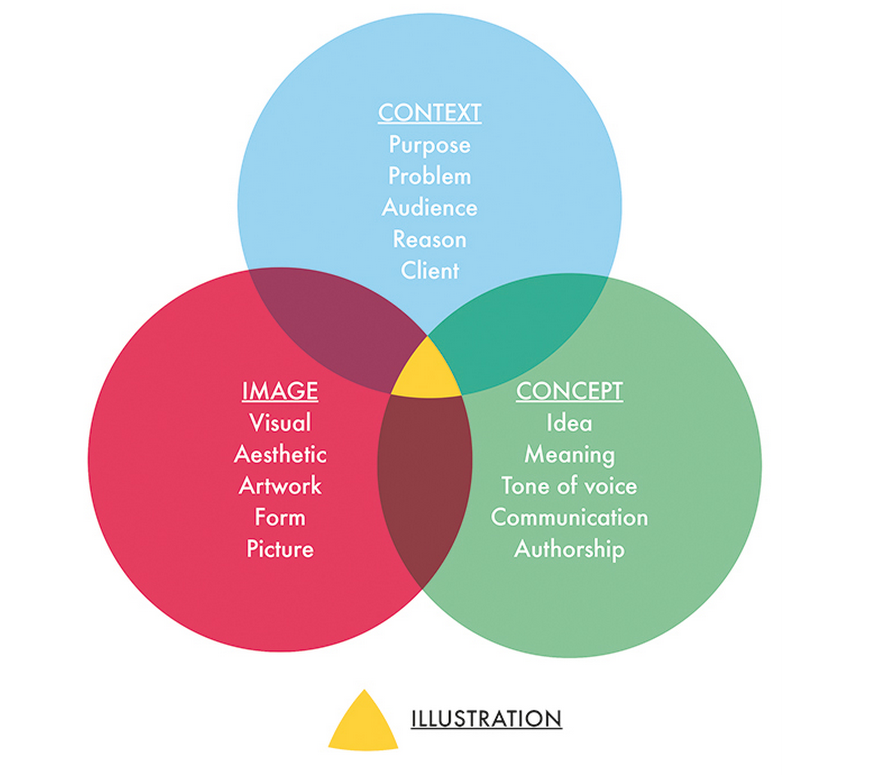
Strategic image making, used within the context of visual communication to convey meaning or concept.
The history of illustration is as old as the human race from when language evolved. We rely on cave paintings to tell us about the past. They come together to form the first language and first visual literacy and we as people are 'hard wired' to respond to this imagery.
Illustration is very much the development of signs and symbols into a more picturesque form. The very nature of the aesthetics of an illustration are what make it substantially different to signs and symbols, be it through different choices of media or different ways of line making, that's what makes it different to graphic design.
The important thing about good illustration is that there is a communication of a message through an original tone of voice, with individuality. Not only can illustrations convey a message but through the medium and mark making they have a chance to convey subtle or abstract sensibilities.
Illustration exists as a sub genre of the broader art form of visual communication. Examples of how an ilustrator may get comissioned work are through:
Art director commissions illustration for a newspaper
Graphic Designer employs illustrator to work on branding project
Museum curator briefs Illustrator on mural piece for exhibition
Photographer gets illustrator to design props for set
Creative Agency buys artwork from Illustrator to use in new branding campaign
Flagship store employs illustrator to collaborate on visual merchandising for shop window display.


Although these are just the ones from this lecture, some of my favourite ilustrators are, Gemma Correl, Jonathan Edwards, Marc Johns, Ronald Searle(arguably caricature), Ralph Steadman (especially the Extinct Boids) and Shaun Tan and his exquisite line marking abilities.
 Jonathan Edwards


 Ronald searle


 Shaun Tan.
What is Illustration?
‘…a shining, a spiritual illumination, vivid representation, an enlightening, light up, illuminate, make clear, disclose, explain, adorn, shine light, act of making clear in the mind…’
It is often an addition to something else to add meaning and give light to a message.
Strategic image making, used within the context of visual communication to convey meaning or concept.
The history of illustration is as old as the human race from when language evolved. We rely on cave paintings to tell us about the past. They come together to form the first language and first visual literacy and we as people are 'hard wired' to respond to this imagery.
Illustration is very much the development of signs and symbols into a more picturesque form. The very nature of the aesthetics of an illustration are what make it substantially different to signs and symbols, be it through different choices of media or different ways of line making, that's what makes it different to graphic design.
The important thing about good illustration is that there is a communication of a message through an original tone of voice, with individuality. Not only can illustrations convey a message but through the medium and mark making they have a chance to convey subtle or abstract sensibilities.
Illustration exists as a sub genre of the broader art form of visual communication. Examples of how an ilustrator may get comissioned work are through:
Art director commissions illustration for a newspaper
Graphic Designer employs illustrator to work on branding project
Museum curator briefs Illustrator on mural piece for exhibition
Photographer gets illustrator to design props for set
Creative Agency buys artwork from Illustrator to use in new branding campaign
Flagship store employs illustrator to collaborate on visual merchandising for shop window display.
Even though there is a recession there is a demand for illustrators as there key skills can overlap into so many other departments.
'With the inclusion of moving image and the web, there is a massive demand for visual content within contemporary media. Brands, publishers, businesses and products are all desperate to develop deep and genuine relationships with consumers.'
'With the inclusion of moving image and the web, there is a massive demand for visual content within contemporary media. Brands, publishers, businesses and products are all desperate to develop deep and genuine relationships with consumers.'
How Do we define good Illustration?
Good illustration is more than illumination.
It can be more than vapid, trend driven cool (cool doesn't exist).
It can be more than twee, pretty embellishment. It can be functional, have a message and have emotional impact.
Good illustration is more than illumination.
It can be more than vapid, trend driven cool (cool doesn't exist).
It can be more than twee, pretty embellishment. It can be functional, have a message and have emotional impact.
The most important thing when looking at design work is the willingness to form your own opinion.
During the Lecture Matt shared with us some examples of his favourite types of illustration and how he has fallen in love with them. Although I appreciated almost all of them, my select favourites were;
Although these are just the ones from this lecture, some of my favourite ilustrators are, Gemma Correl, Jonathan Edwards, Marc Johns, Ronald Searle(arguably caricature), Ralph Steadman (especially the Extinct Boids) and Shaun Tan and his exquisite line marking abilities.
Jonathan EdwardsRonald searleShaun Tan.Sunday 9 March 2014
COP Lecture 3 : Type, Production and Distribution
Animation by Boca and R. Urich.
'The written word endures.. The Spoken word Disappears' Neil Postman, Amusing ourselves to death.
There is a need for a physical representation of our language. The very first alphabet was the Greek alphabet.
The Main Origins of type are formed from;
Brush work in the orient,
Stone Carvings,
Bone ribs and quills made for arabic language,
Wood Block and print,
Followed by Hot Metal Letters.
It is a print process, a production method.
In 1450 Johannes Gutenberg created the first print press for bibles.
Type can be classified into Categories:
Classic Old Style, 1450-1700.
Transitional, 1700-1790.
Modern, 1790-1870.
Bauhaus/Swiss Mod. 1870,1960.
Contemporary, 1960-2000.
In 1870 William Foster set the framework for providing education for children age 5-12.
In 1919 William Gropias created typewriters, the bauhaus was set up and the principle of form over function was created.
In 1957 Max Miedinger from the Bauhaus created Helvetica Font.
Neutral, designed s a brand and an identity designed on what it needed to do.
'Great Clarity, no intrinsic meaning in it's form.' Helvetica, the film.
Then precisely 25 years after Arial ripped off Helvetica.
In 1990 Steve Jobs created the first affordable desktop computer so their could be a new era of digitalisation in type.
In the same year Vincent Connare invented comic sans, boooo.
And Tim Berners created the internet for free.
And then in 1995 Bill Gates globally made Internet Explorer.
COP Lecture 2: Visual Literacy
Visual Communication: Is the process of sending and receiving messages using type and image, based on a level of shared understanding, of signs, symbols, gestures and objects.
The ability to interpret, make and design the form of a image for a purpose.
For example toilet signs can be read through symbols.


The ability to interpret, make and design the form of a image for a purpose.
For example toilet signs can be read through symbols.
These are universal and cultural symbols.
Visual Syntax: a pictorial structure.
Visual Semantics: where the image fits the cultural process.
Semiotics: Study of signs.
Symbols can be logos.
Signs form an identity.
And a signifier forms a brand.
Visual Synecdoche, is when a part is used to represent the whole.
Visual Metonym, a symbolic image is made to make a reference to something with a more literal meaning.
Visual Metaphor is used to transfer one meaning to another. Every object has the chance to mean more, the metaphor must be 'worked.'
Visual language meant a lot to me because it strips design back to the basics, and all forms of design and art strive to choose parts of a composition simplify what is real and enough has to be chosen to make a good piece of art/design work. And if too much is chosen it can be overcomplicated. This can be applied to animation by keeping the narrative/characters/any element simple enough for telling the story, conveying a message but without being over complicated and ending up confusing the audience. It is a skill that takes a lot of practice and one that no animator/designer/filmaker/creative can ever believe they have mastered as when we reflect we always want to add more, or take out, however with each piece of work we can improve this skill.
COP Lecture 1: An overview of the Module
In this lecture, James went through an example of a piece of work in time that helped shape the courses history, but also provided context and background knowledge to help understand each piece. These examples are important to provide an important depth of knowledge on each piece so that we ourselves know how much detail we are expected to research into other pieces of work.
Starting with Photography...
The Worktown Project, Bolton, 1937.


Starting with Photography...
The Worktown Project, Bolton, 1937.
This collection of Documentary photos provided mass observation by a group of Gentleman called. T. Harris, J. Humphrey, C. Madge and S. Humphrey.
The context of the period includes having a fall in the economy, depression a recession, Hitler, etc.
Questions posed because of the context is that because the men taking the photo's of the working class are wealthy does that make these photo's condescending? If it was other working class men taking photo's would that provide images of a different setting? Is it contrived?
This is the very definition of documentary photography as it's never objective and it's always taken from point of view shots.
Animation.
Jiri Trnka - The Hand, 1965
The context of this animation is that it was made 20 years after world war two during the height of the cold war, it makes a subversive radical statement about the government at the time, and for this reason Jiri Trnka did not get a state funeral even though he is often classified as the walt disney of the east.
During this animation the little puppet gets money from the state and under dictatorship has to make hands instead of pots for his little plant, and he gets rewarded with a golden cage symbolising his freedom being taken away from him. The whole story revolves around the animators point of view of communism and censorship. More on this in another blog post.
Advertising.
Tony Kaye, Tested for the Unexpected, Dunlop Tyres. 1993.
Tony Kaye was given an unlimited budget for this advert and came up with this very surreal, very seventies-esque in the colour scheme, make up and general haze on the piece. The director thought it was so good he tried to get it exhibited at the Tate. I think it's very fitting to have The Velvet Underground on the soundtrack, it works really well and proves that advertising is a form of art.
Illustration.
Norman Rockwell, 1940's/1950's.
A portrayl of twee american life, representing the beneveolency of a nuclear family.
These images were taken by Roosevelt and used as Propaganda, the profiency of it all symbolised the end of a golden era, where illustrators were replaced by digital technologies.
Graphic Design.
Typography is influential to you all!
In 1932 Times New Roman was created, the structure and form of the font represents the greatness of a national empire with the greatness of the roman empire.
Franktaur Font was adopted by the Nazi's and the Germanic empire, taken from middle age Germanic Gothic helped symbolise the prowess and german superiority through typeface in Propaganda.
Herbert Bayer created the first universal type, a left wing statement that was supposed to be entirely neutral with no historic background. It was designed to unify not to separate.
End of lecture.
Remember when doing academic writing to harvard reference and include code OUAN401.
Subscribe to:
Posts (Atom)